Almonds.com
Flexible design system for a global audience.
Project Info
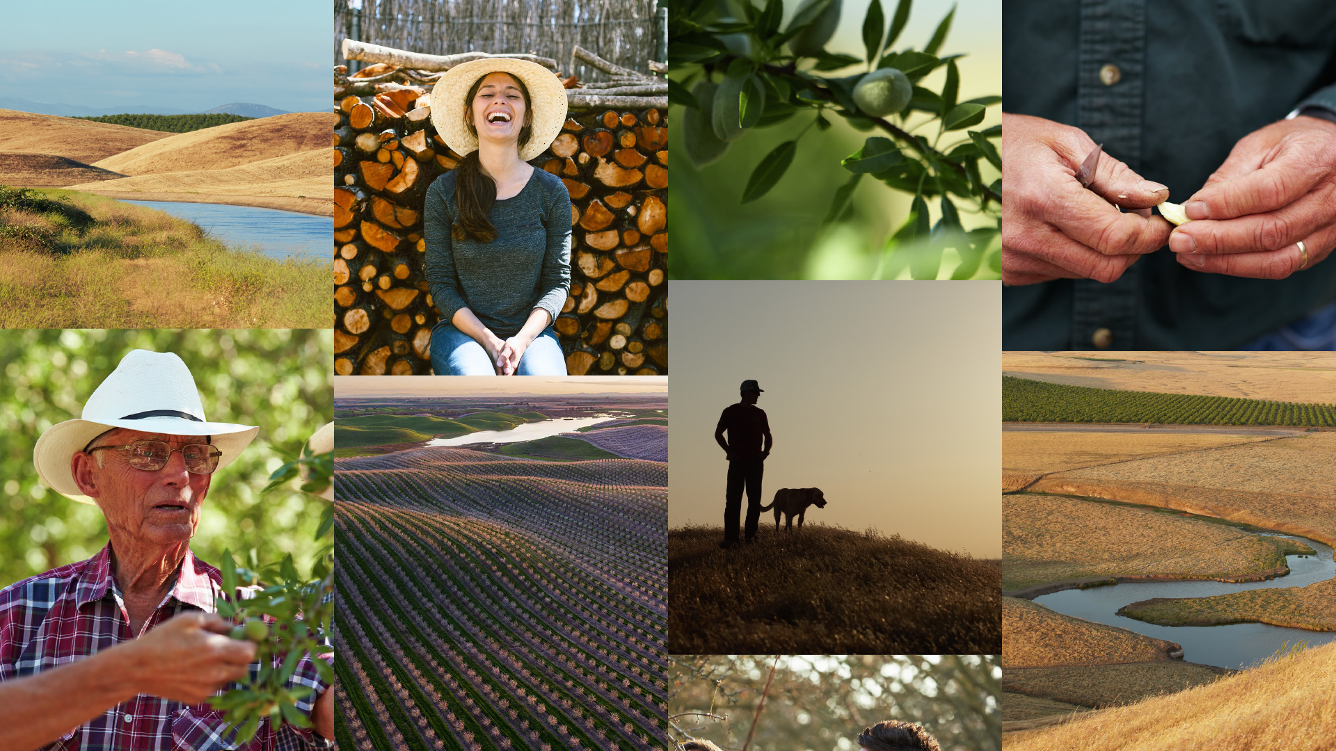
The Almond Board of California supports the almond-growing community by developing global market demand for almonds as well as investing in research to help improve farming and processing practices.
The organization supports a multitude of audiences from consumers to industry and health professionals across North America, Europe, and Asia.
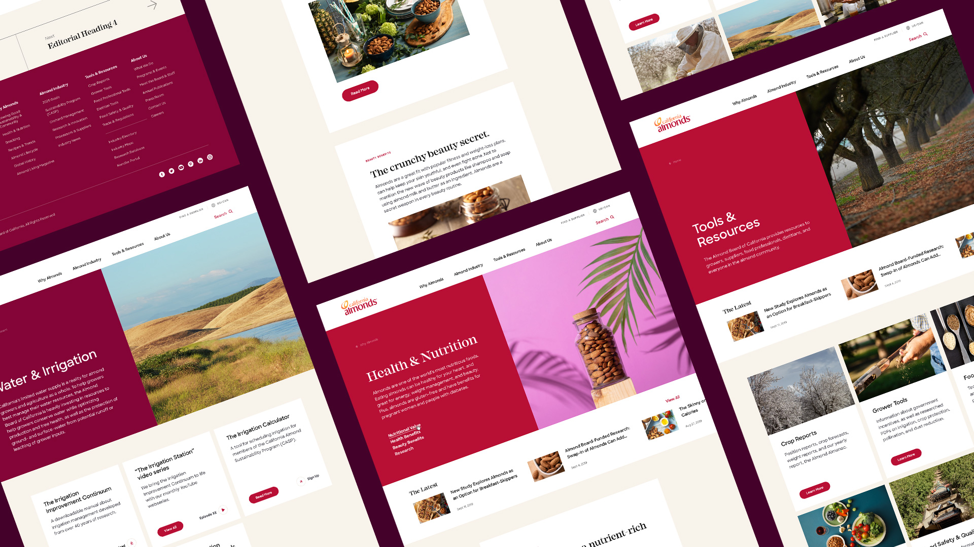
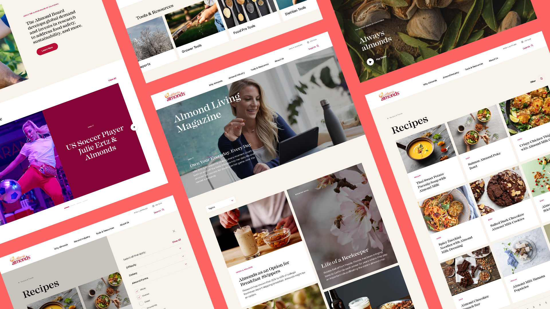
Our mission was to elevate Almonds.com into something to do, not just read. We redesigned the website with the idea of it being a modern-day, aspirational library for the almonds community—a place where work gets done, a deep well of knowledge can be found, and big ideas are born.
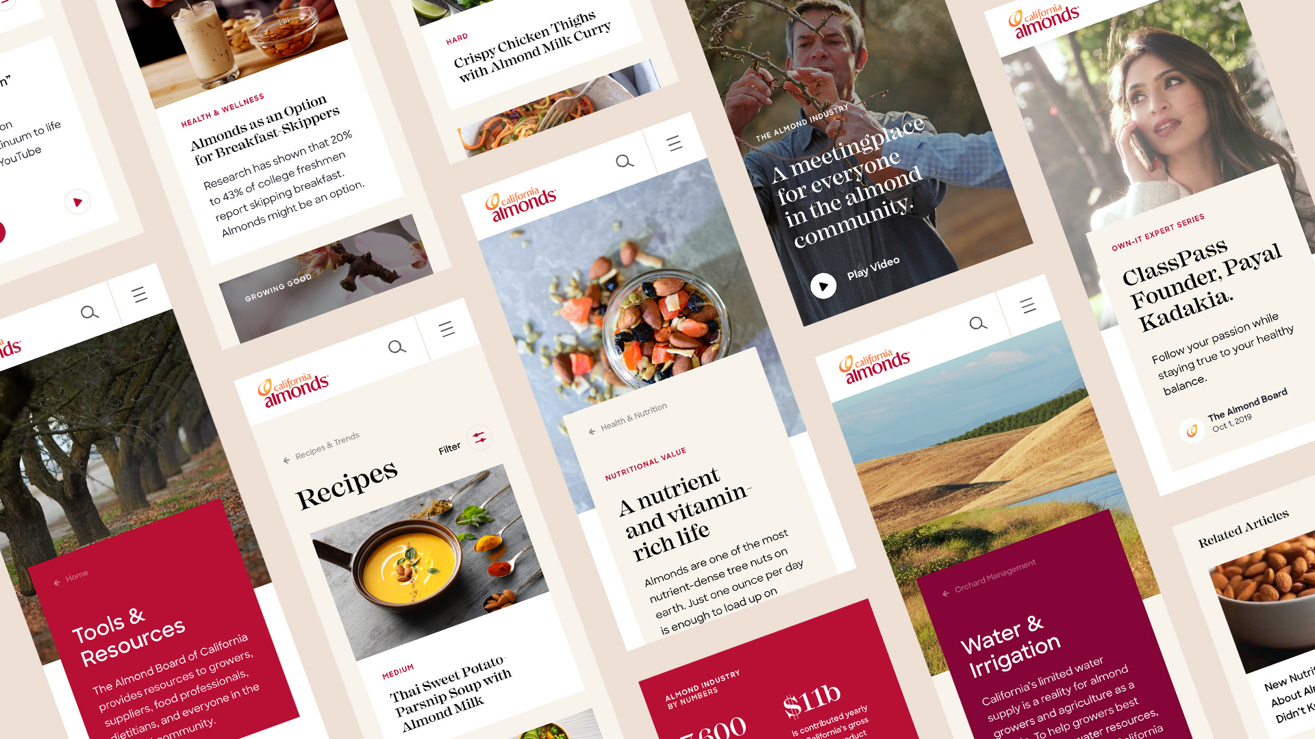
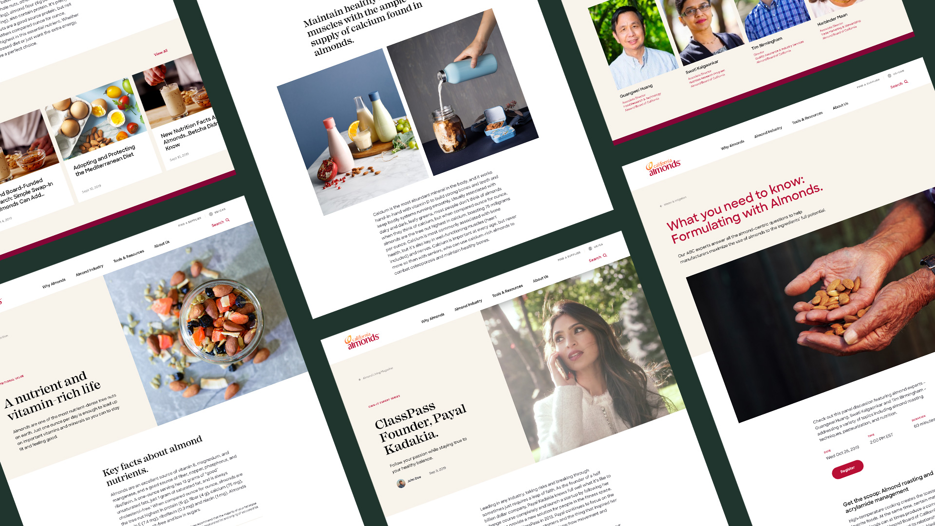
The end result is a useful, modern website— with a flexible design system to adapt to global audiences. Combined with a machine-learning search engine, almonds.com became the place to speak to almond growers and almond lovers alike.
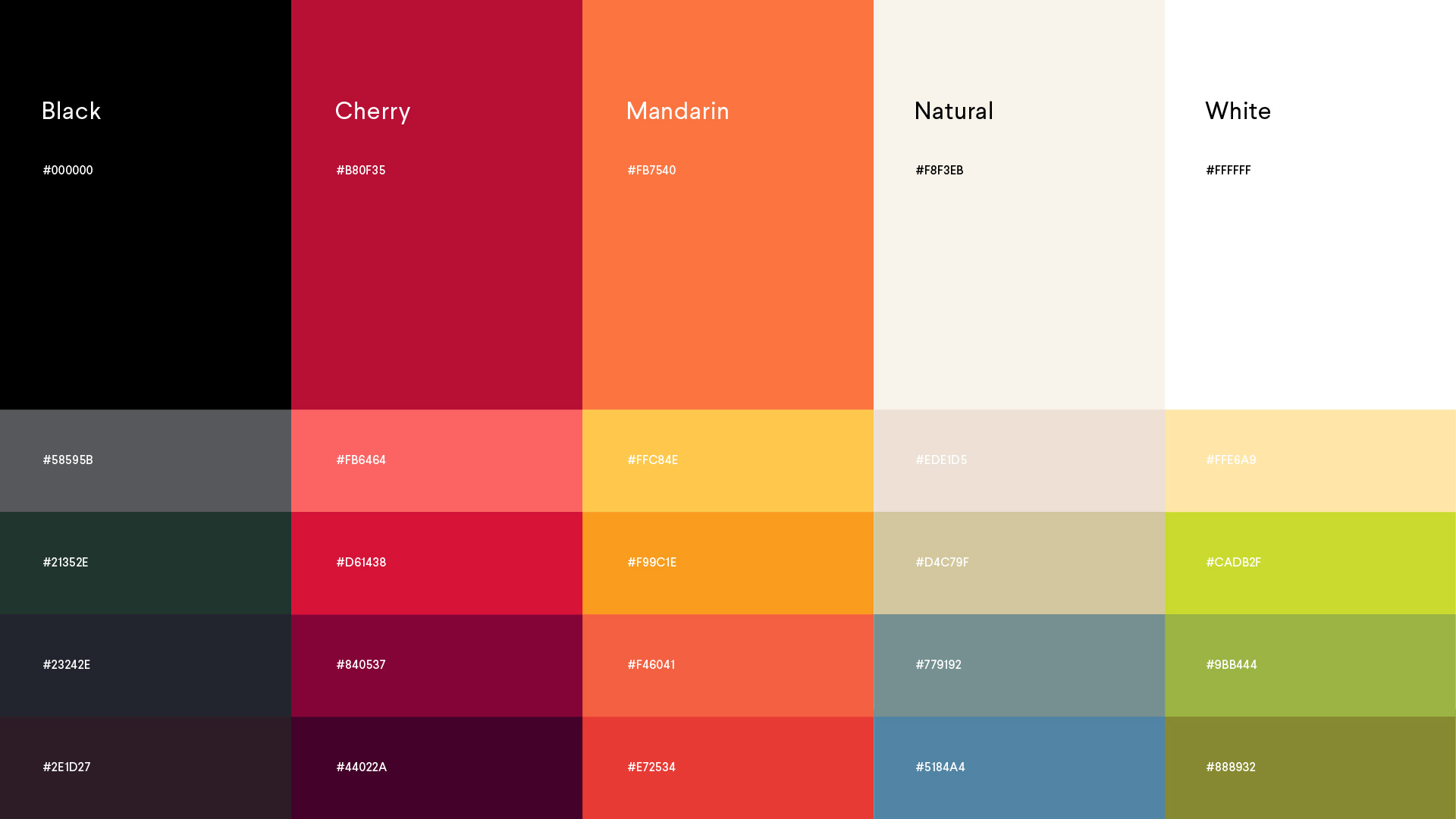
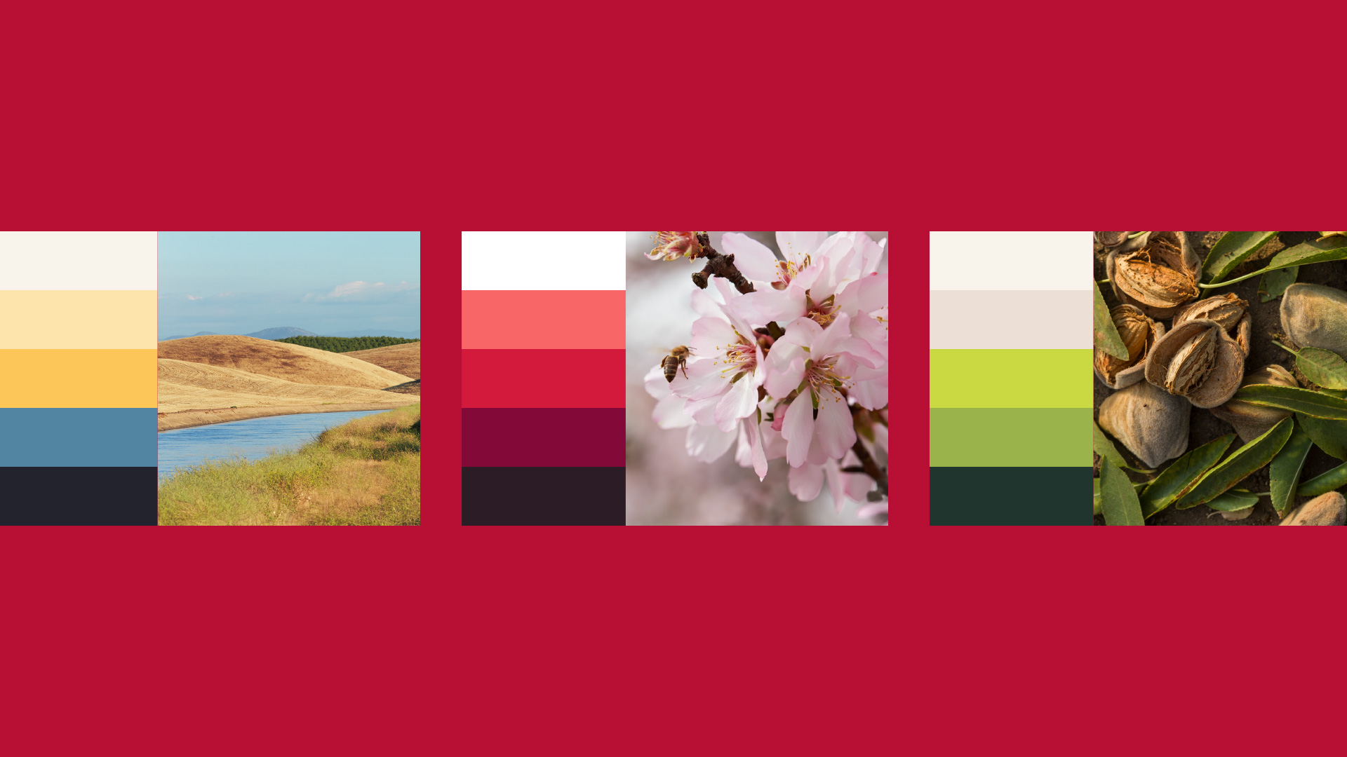
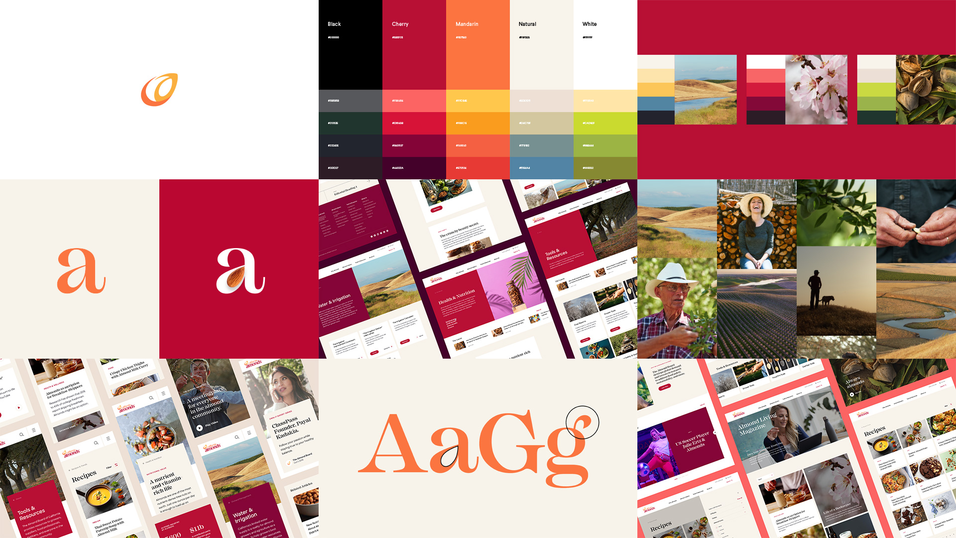
The brand's primary digital palette was refined for screens and stripped back to reflect the confidence and focus at the heart of the brand and
avoid diluting the visual impact. A secondary palette, inspired by the Californian landscape, was created as an extension of the current brand colors and will be used for everything from campaigns and regional markets to UI elements.
avoid diluting the visual impact. A secondary palette, inspired by the Californian landscape, was created as an extension of the current brand colors and will be used for everything from campaigns and regional markets to UI elements.
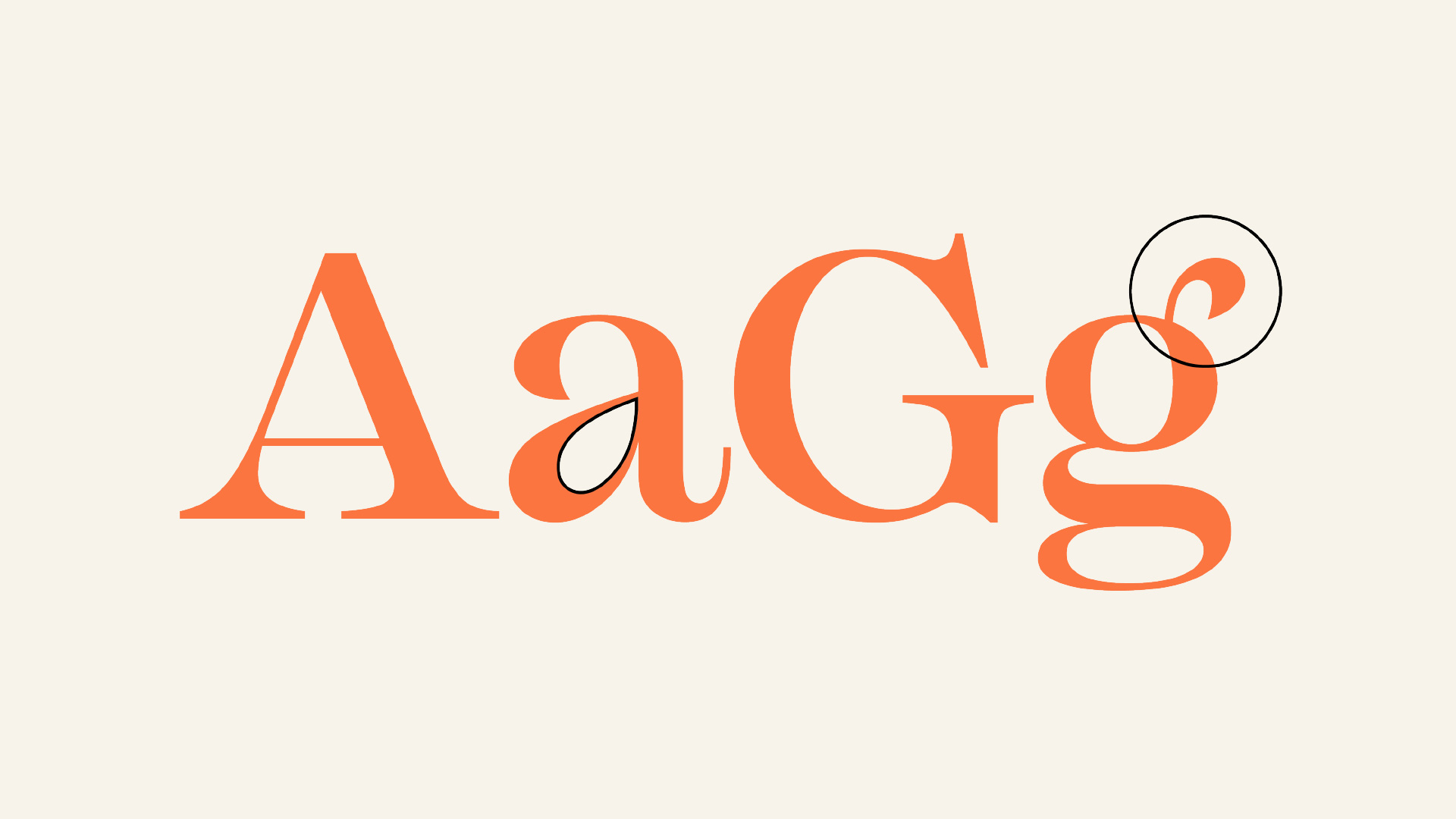
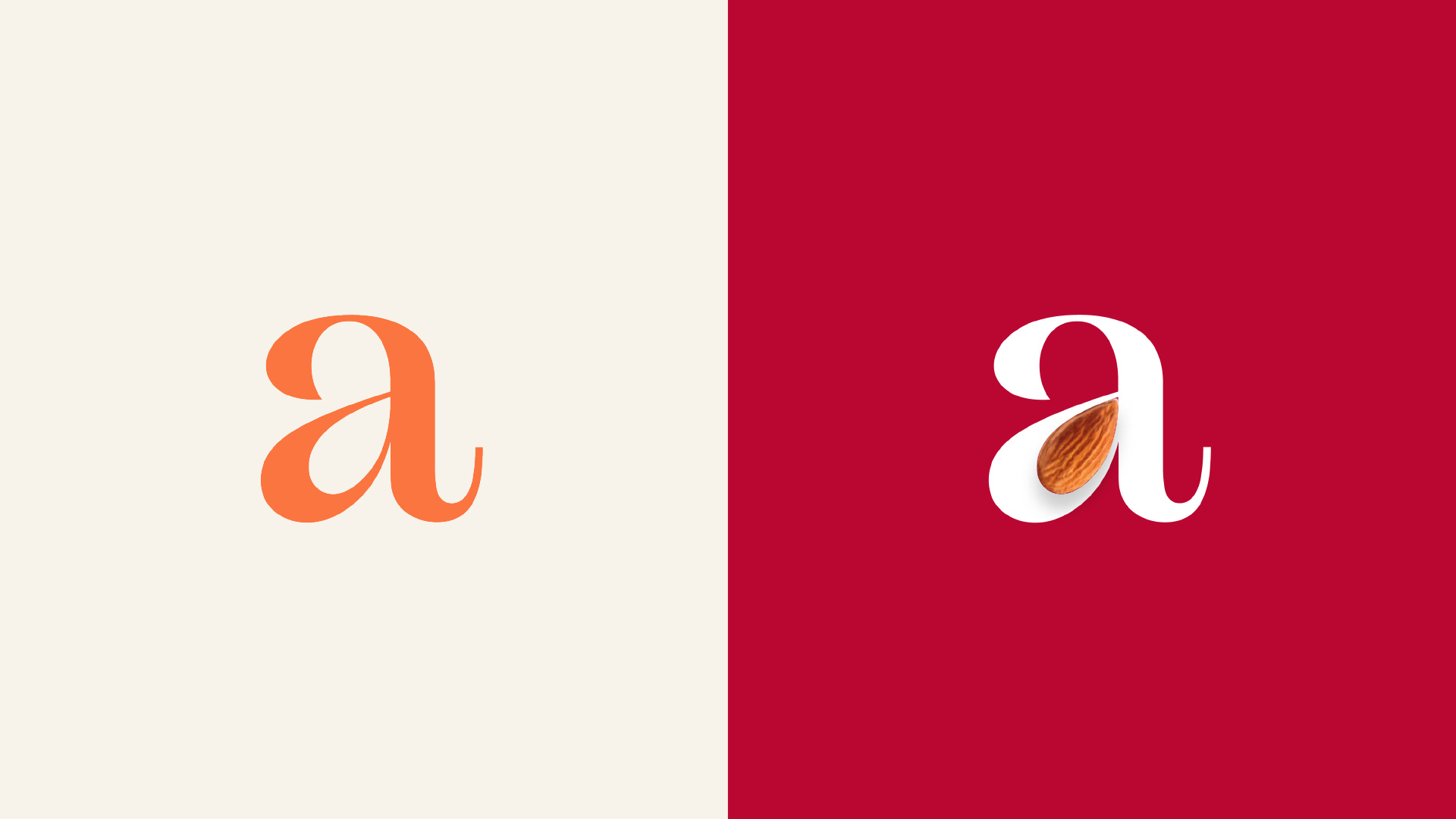
We’ve paired their primary brand typeface with a secondary serif typeface to create an editorial feel. Mackay is a powerful and elegant font with curvy/organic details to link back to the products. For all character-based languages, we use Mackay for numbers and editorial-based English headlines.
—
Agency: Deutsch LA
Client: Almond Board of California
Role: Design Director
—
Team:
Head of Design: Adhemas Batista
Design Director: Jean-Lou Renoux
UX Director: Elizabeth Cordingley
Visual: Karen Pham, Amy Lee
XD: Angie Kang
Design Director: Jean-Lou Renoux
UX Director: Elizabeth Cordingley
Visual: Karen Pham, Amy Lee
XD: Angie Kang